
Vous recherchez probablement un t-shirt imprimé pour homme pour une raison simple. Vous voulez quelque chose de facile à porter qui reste réfléchi. Pas fragile. Pas plastifié. Pas le genre de t-shirt qui a l'air impeccable en ligne, puis arrive avec un graphisme rigide, une couture latérale tordue et un col qui se déforme après quelques lavages.
Cette frustration est compréhensible. Un t-shirt imprimé se situe au carrefour du confort, du style et du savoir-faire, plus que beaucoup de consommateurs ne le réalisent. Le tissu affecte la façon dont l'imprimé adhère. La méthode d'impression modifie le toucher. La coupe détermine si le motif semble intentionnel ou maladroit. Si une partie est défectueuse, l'ensemble du t-shirt semble moins cher qu'il ne devrait l'être.
Une meilleure approche consiste à juger le vêtement comme un objet complet. Cela signifie se demander comment le coton se sent, comment l'encre se comporte, où l'œuvre d'art est placée sur la poitrine, et si le t-shirt aura toujours fière allure après un usage régulier dans une garde-robe canadienne qui passe par la chaleur sèche intérieure, l'air froid extérieur et les lavages fréquents.
Au-delà de l'essentiel : redéfinir le t-shirt imprimé
Le t-shirt imprimé pour homme était autrefois traité comme un basique jetable. Cela est en train de changer. De plus en plus d'acheteurs veulent moins de pièces, mais de meilleure qualité. Ils veulent un t-shirt qui puisse être porté seul avec un pantalon, disparaître discrètement sous un tricot, et garder sa forme lorsqu'il est porté de manière décontractée à plusieurs reprises.
Ce changement n'est pas seulement une préférence stylistique. Il se manifeste sur le marché. L'Amérique du Nord, y compris le Canada, devrait détenir une part de 39,3 % du marché mondial de l'impression de t-shirts personnalisés en 2026, évaluée à environ 2,69 milliards de dollars américains, les canaux en ligne devant capter 63,1 % des ventes, selon le rapport du marché de l'impression de t-shirts personnalisés de Coherent Market Insights. Cela vous indique que les t-shirts imprimés ne sont pas un achat de niche. Ils représentent une part importante de la façon dont les gens construisent des garde-robes décontractées modernes.
Ce qui compte, c'est la différence entre un t-shirt simplement décoré et un t-shirt bien conçu.
Un t-shirt imprimé de mauvaise qualité sépare souvent ses éléments. Le tissu est choisi pour son coût. Le graphisme est choisi pour sa visibilité. La coupe est générique. Rien ne fonctionne ensemble.
Un t-shirt bien fait fait le contraire. Il traite le vêtement comme un système.
- Le tissu donne une base à l'imprimé afin que le motif ne ressemble pas à un autocollant.
- La méthode d'impression façonne le toucher de la surface et la façon dont l'œuvre vieillit.
- La coupe contrôle l'équilibre visuel afin que le motif flatte le corps au lieu de le combattre.
Un t-shirt imprimé haut de gamme ne devrait pas vous demander de choisir entre le style et le confort. S'il est bien fait, l'imprimé, le tissu et la coupe se soutiennent mutuellement.
C'est pourquoi un t-shirt imprimé mérite plus d'attention qu'un t-shirt uni. Le t-shirt uni ne doit réussir qu'en tant que tissu et coupe. Le t-shirt imprimé doit réussir en tant que tissu, coupe et conception de surface, le tout en même temps.
Décoder les graphiques, les méthodes et le toucher de l'impression
Un graphisme peut paraître excellent sur une maquette et pourtant mal se sentir sur le corps. Cela est généralement dû à la méthode d'impression. Si vous avez déjà touché un t-shirt qui semblait lisse et intégré, puis un autre qui semblait caoutchouteux et lourd, vous avez déjà remarqué la différence.

La sérigraphie et le DTG ne sont pas la même expérience
La sérigraphie fonctionne un peu comme la superposition de couleurs à travers un pochoir. Chaque couleur nécessite son propre écran. C'est pourquoi les illustrations simples et audacieuses conviennent souvent à cette méthode. La configuration est plus complexe, mais le résultat peut être solide et net.
Le côté technique est également important. La sérigraphie nécessite généralement des fichiers vectoriels au format EPS et en mode couleur CMJN, car chaque couleur est séparée en sa propre couche, tandis que l'impression directe sur vêtement (DTG) utilise des fichiers raster en mode RVB, comme indiqué dans les exigences de modèle de t-shirt d'Envato. Cette différence de fichier n'est pas seulement pour les concepteurs. Elle reflète à quel point les deux méthodes sont construites différemment.
Le DTG, ou Direct-to-Garment, se comporte davantage comme une impression directe sur la surface du tissu avec un processus numérique. Il est souvent mieux adapté aux illustrations avec des détails fins, des transitions plus douces et une sensation moins construite sur le t-shirt.
Voici la distinction pratique :
- La sérigraphie vous donne généralement plus de présence physique sur le tissu
- Le DTG vous donne généralement une impression visuelle et tactile plus douce
- Ni l'un ni l'autre n'est universellement meilleur. Le bon choix dépend de l'illustration, du tissu et de l'ambiance souhaitée du t-shirt
Le toucher sur le tissu compte plus que beaucoup de consommateurs ne s'y attendent
Quand les gens disent qu'une impression est « premium », ils veulent généralement dire l'une des deux choses suivantes.
Parfois, ils veulent un graphique avec du corps. Une impression bien exécutée peut ajouter une subtile couche tactile qui rend le design délibéré. Dans d'autres cas, ils veulent que l'impression se fonde dans le t-shirt afin que le coton reste la sensation principale contre la peau.
C'est pourquoi il est utile de penser par paires :
| Méthode | Sensation sur le tissu | Durabilité | Idéal pour | L'approche d'IdyllVie |
|---|---|---|---|---|
| Sérigraphie | Plus tactile, souvent légèrement en relief | Solide pour les graphiques audacieux lorsqu'elle est bien réalisée | Logos nets, formes simples, moins de couleurs | Impressions durables qui conviennent au coton épais |
| DTG | Toucher plus doux, moins de matière en surface | Bon si adapté au bon tissu et aux bons soins | Illustrations détaillées, graphiques ton sur ton, effets visuels plus légers | Graphiques raffinés qui ne dominent pas le vêtement |
| Sublimation | Sensation intégrée sur tissu synthétique approprié | Fini lisse sur le bon matériau | Applications intégrales synthétiques | Moins aligné avec les t-shirts en coton épais |
| Vinyle thermocollant | Repose sur le tissu avec une couche distincte | Peut être efficace pour des usages spécifiques | Éléments de texte, formes nettes, applications de niche | À utiliser de manière sélective plutôt que par défaut |
Ce que les acheteurs manquent souvent
Le même graphisme peut avoir une sensation complètement différente selon le t-shirt sur lequel il est appliqué.
Une impression dense sur un t-shirt fin peut créer un déséquilibre. Le tissu bouge d'un côté, l'impression de l'autre. Le t-shirt se tord, s'étire ou pend étrangement. Sur un tissu plus épais, l'impression a suffisamment de support pour se poser naturellement.
C'est pourquoi la conception de vêtements haut de gamme commence par la sensation finale souhaitée, et non seulement par le fichier artistique.
Règle pratique : Demandez-vous si vous voulez que le motif repose sur le t-shirt ou qu'il vive dans le t-shirt. Cette seule question vous oriente souvent vers la bonne méthode d'impression.
Pourquoi les marques haut de gamme limitent certains graphismes
Si vous vous êtes déjà demandé pourquoi certains des meilleurs t-shirts utilisent des illustrations sobres plutôt que de grandes impressions frontales flashy, la raison est souvent technique, et non timide.
Les grands graphiques denses peuvent :
- Réduire la respirabilité sur la zone imprimée
- Ajouter du poids au panneau avant, de sorte que le t-shirt drape moins proprement
- Modifier la douceur à l'endroit exact où votre corps le ressent le plus
Un t-shirt imprimé pour homme bien pensé utilise des graphiques avec discipline. L'imprimé doit soutenir le caractère du vêtement. Il ne doit pas dominer le coton ou aplatir la silhouette.
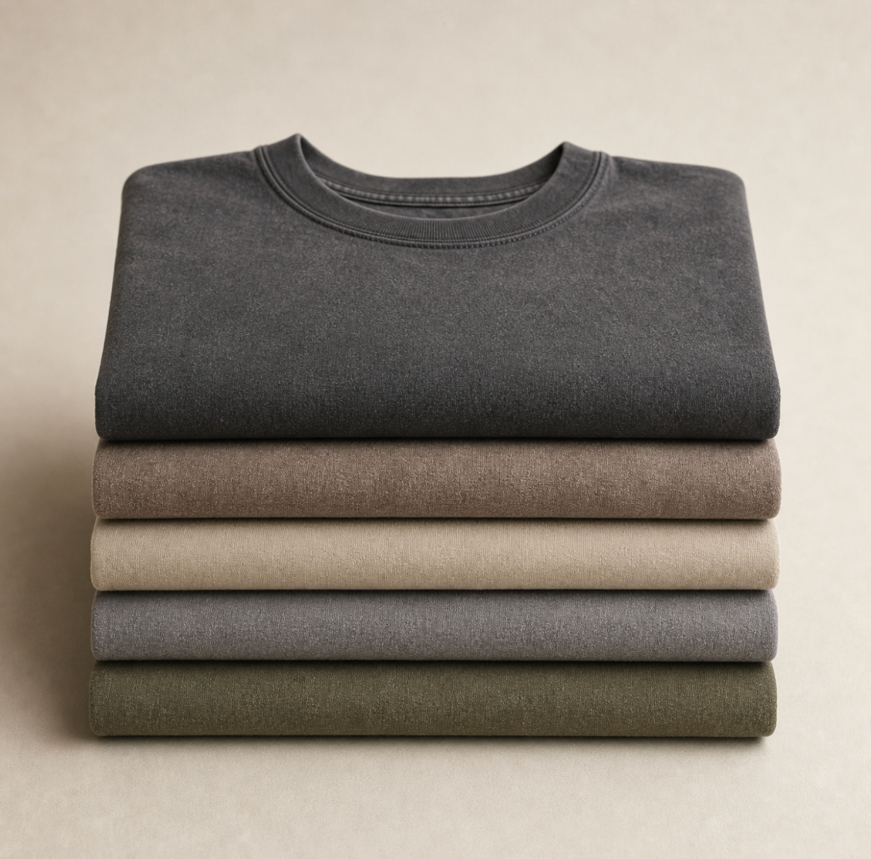
Le fondement du tissu : du coton biologique au délavage à la pierre
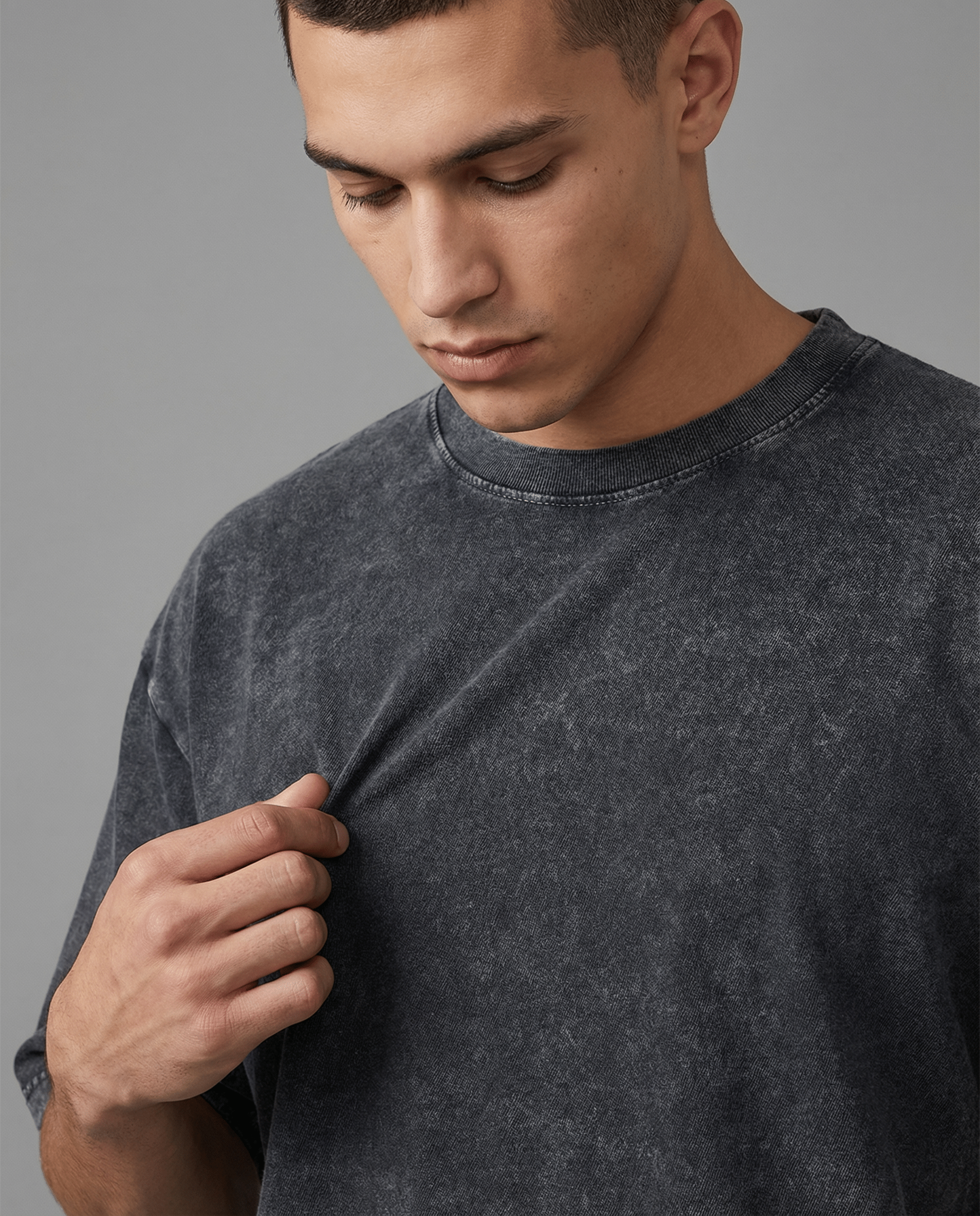
Une impression ne fonctionne que si le tissu sous-jacent est de qualité. Si le tissu est faible, mal fait ou trop fin, même un bon graphique ne sauvera pas le t-shirt. Vous le verrez d'abord au col, puis dans le corps, puis dans la façon dont l'impression vieillit à mesure que le tissu se déplace et s'use de manière inégale.

Pourquoi la qualité du coton change tout
Tous les t-shirts en coton n'ont pas la même sensation car tous les cotons ne sont pas traités, filés et finis de la même manière. Un t-shirt de qualité supérieure est généralement plus lisse, plus dense et plus stable au toucher. Il ne s'affaisse pas lorsque vous le prenez.
Pour un t-shirt imprimé, cela compte de trois manières :
- La surface est plus propre, donc les graphiques sont plus nets
- Le corps a plus de structure, donc l'imprimé tombe mieux
- Le t-shirt dure plus longtemps, donc le graphique a plus de chances de bien vieillir
Le coton biologique ajoute une autre couche de valeur pour les acheteurs soucieux de la fabrication d'un vêtement, mais l'étiquette seule ne suffit pas. Vous voulez toujours savoir comment le tissu se comporte. Est-il respirant ? Se remet-il après l'usure ? Est-il épais sans devenir rigide ?
Un bon point de départ est d'apprendre comment la construction du tissu affecte l'usure quotidienne. Ce guide sur les t-shirts en coton de qualité supérieure et pourquoi le coton respirant prélavé est important décompose les qualités que les gens ressentent souvent mais ont du mal à nommer.
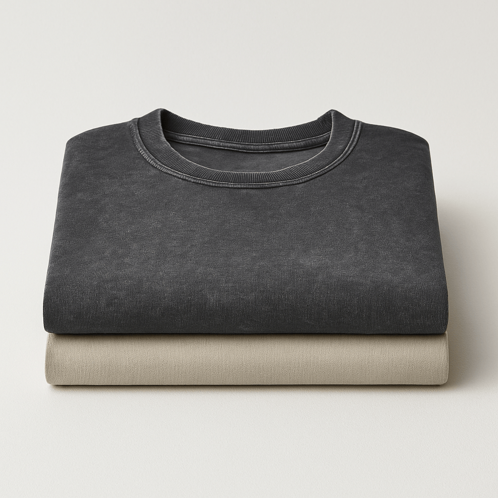
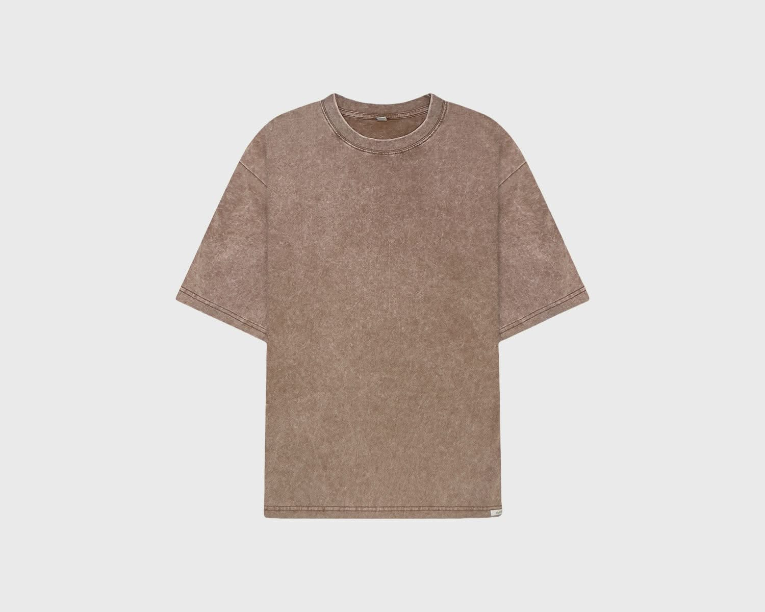
Le coton délavé à la pierre offre un autre type de confort
Le délavage à la pierre modifie la tonalité émotionnelle d'un t-shirt autant que sa tonalité physique. Un t-shirt en coton ordinaire peut sembler net et simple. Un t-shirt délavé à la pierre a souvent un aspect usé, adouci et visuellement plus discret.
C'est important pour les vêtements imprimés, car une surface adoucie et usée peut rendre l'illustration plus intégrée et moins promotionnelle. Le t-shirt est alors perçu comme faisant partie d'une garde-robe, et non comme un simple produit dérivé.
Voici ce qu'un délavage à la pierre apporte souvent :
- Un toucher plus doux dès le premier porté
- Une subtile variation de couleur qui ajoute de la profondeur
- Un caractère visuel plus décontracté qui se marie bien avec des graphiques discrets
Le tissu et l'imprimé doivent s'harmoniser
Un t-shirt imprimé pour homme raffiné présente généralement une harmonie entre le tissu et l'œuvre d'art.
Une impression audacieuse, plate et brillante sur un t-shirt doux au style vintage peut sembler dépareillée. De même, un motif délicat et délavé sur un t-shirt ultra-lisse à l'aspect synthétique. Les meilleurs vêtements créent de l'harmonie.
Vous pouvez vérifier cela rapidement en vous posant la question suivante :
| Ce que vous remarquez | Ce que cela peut indiquer |
|---|---|
| Le t-shirt est épais et lisse | L'imprimé a une meilleure base et peut s'user plus uniformément |
| Le tissu est déjà doux, pas mou | Le t-shirt pourrait devenir un favori plus rapidement sans perdre sa forme immédiatement |
| La surface a de la profondeur grâce au lavage ou à la finition | Le graphique peut paraître plus mature et moins produit en série |
Un t-shirt premium doit être convaincant avant même que vous ne regardiez l'œuvre d'art. Si le tissu déçoit, l'impression ne le sauvera pas.
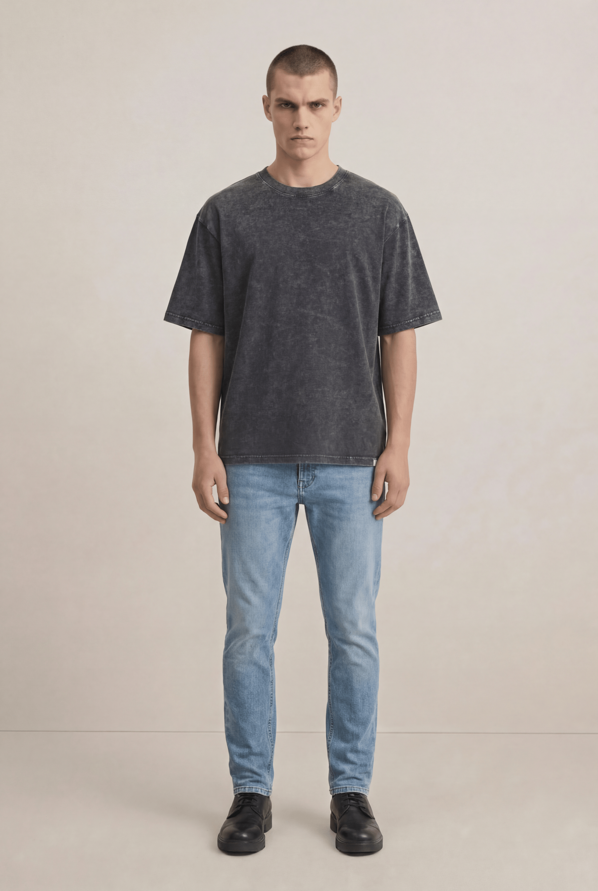
Maîtriser la coupe : tailles et silhouettes expliquées
La coupe détermine si un t-shirt imprimé a l'air soigné ou négligé. Vous pouvez avoir un excellent coton et une impression bien faite, mais si le corps est trop serré, trop long, trop court ou trop large pour le graphisme, l'ensemble du t-shirt ne va pas.

Choisissez la silhouette avant la taille
Beaucoup de gens passent directement au S, M, L ou XL. Commencez plutôt par la forme.
La coupe ajustée épouse plus étroitement le torse. Elle convient généralement aux petits graphiques de poitrine ou aux impressions plus discrètes, car le motif s'étend sur les contours du corps.
La coupe classique offre une ligne plus droite au niveau de la poitrine et de la taille. C'est souvent la forme la plus facile pour les t-shirts imprimés, car la plupart des graphiques s'y posent naturellement.
La coupe décontractée ajoute de l'aisance et une silhouette plus actuelle. Elle peut être excellente avec des illustrations discrètes, surtout lorsque le t-shirt repose sur le drapé et la présence du tissu plutôt que sur un logo voyant.
Un guide des tailles aide, mais seulement si vous l'associez à la silhouette que vous préférez. Pour une référence pratique, ce tableau des tailles de vêtements canadien est utile lorsque vous comparez des mesures plutôt que de deviner à partir des étiquettes seules.
Le placement de l'imprimé modifie l'apparence du corps
Les designers ne placent pas une impression sur la poitrine par simple instinct. Un bon placement suit la proportion.
Le placement professionnel des imprimés commence à environ 2 à 3,5 pouces du col. Une impression standard au centre de la poitrine mesure environ 6 à 10 pouces de large, tandis qu'une impression pleine face mesure généralement 10 à 12 pouces de large, selon le guide de Printify sur la taille et le placement des motifs de t-shirts. Ces normes existent parce qu'une impression placée trop haut peut sembler étouffante, et une impression placée trop bas peut faire paraître le torse plus long et moins équilibré.
Cela compte encore plus selon les tailles. Un graphique qui semble centré sur un médium peut sembler mal placé sur un petit ou un XXL s'il n'est pas mis à l'échelle et positionné de manière réfléchie.
Voici un rapide contrôle de la coupe pour un t-shirt imprimé pour homme :
- Les épaules doivent se terminer près de votre ligne d'épaule naturelle, ne pas tomber loin derrière, sauf si le style est intentionnellement décontracté
- Les manches doivent soutenir l'ambiance du t-shirt. Plus nettes et ajustées pour un look plus élégant, plus amples pour un look décontracté
- La longueur doit fonctionner sans être rentrée sans engloutir la silhouette
- L'échelle du graphique doit correspondre à la taille du t-shirt et à la morphologie
Pour voir comment la silhouette modifie l'impression générale d'un t-shirt, il est utile d'observer les vêtements en mouvement plutôt que de seulement étudier des photos plates.
L'imprimé doit flatter, pas combattre
Un grand graphique dense sur le devant d'un t-shirt slim et étroit peut donner l'impression que la poitrine est compressée. Un minuscule logo sur un t-shirt surdimensionné peut disparaître complètement. L'équilibre est l'objectif.
Si la première chose que vous remarquez est le graphique et la deuxième chose que vous remarquez est que le t-shirt tombe étrangement, le design et la silhouette ne fonctionnent pas ensemble.
Les meilleurs t-shirts imprimés mettent d'abord en valeur celui qui les porte. L'œuvre d'art fait partie de cet effet, elle ne le concurrence pas.
Comment styliser votre t-shirt imprimé pour toute occasion
Un bon t-shirt imprimé gagne sa place lorsqu'il dépasse un seul cadre. Il ne devrait pas être confiné à la catégorie « seulement le week-end » à moins que ce ne soit le but du vêtement. Le bon t-shirt peut passer d'un vêtement décontracté de jour à quelque chose de plus raffiné avec seulement quelques modifications autour.
Look un pour une élégance quotidienne
Prenez un t-shirt imprimé pour homme de couleur neutre avec un motif frontal discret. Associez-le à un chino droit de couleur pierre, olive ou bleu marine délavé. Ajoutez des baskets en cuir propres et une surchemise simple si le temps l'exige.
L'effet vient de la retenue. Rien ne se concurrence. Le t-shirt apporte de la personnalité, mais la silhouette reste soignée.
Cela fonctionne particulièrement bien lorsque le tissu a un certain poids et un fini doux. La chemise tombe proprement au lieu de coller, et l'imprimé se lit comme un design plutôt que comme une marque. Vous pourriez le porter pour un brunch, une galerie, un déjeuner en plein air ou un dîner décontracté sans avoir l'air sous-habillé.
Quelques choix de style font la différence :
- Gardez les pantalons structurés afin que la tenue ne dérive pas vers des vêtements de sport
- Choisissez un ton dominant et laissez le graphique apporter le contraste
- Utilisez des chaussures plus propres que vous ne le feriez avec un simple t-shirt à enfiler
Look deux pour des superpositions raffinées
Le même t-shirt peut être porté confortablement sous un cardigan texturé, une couche zippée en maille légère ou un blazer déstructuré. Ajoutez un jean foncé ou un pantalon en laine bien coupé, puis terminez avec des bottes ou des chaussures en cuir minimalistes.
Maintenant, le t-shirt imprimé agit moins comme la star et plus comme l'ancre. Il adoucit la formalité de la couche extérieure tout en donnant de l'identité à la tenue.
La qualité devient visible ici. Une chemise fragile s'affaisse généralement sous les couches. Le col se déforme. L'imprimé semble juvénile. Le corps se tord. Un meilleur t-shirt garde sa ligne, et le graphique ajoute de l'intérêt sans perturber la forme générale.
Le t-shirt imprimé le plus polyvalent ne crie pas pour attirer l'attention. Il donne de la texture, du sens et de la facilité à la tenue.
Pourquoi la même chemise peut paraître chère ou bon marché
Le contexte compte, mais la construction compte davantage.
Un t-shirt imprimé de qualité supérieure est généralement facile à styliser car il possède ces qualités :
| Trait de style | Ce qui le rend efficace |
|---|---|
| Il se superpose proprement | Le tissu a suffisamment de tenue pour garder sa forme |
| Il semble intentionnel avec des pièces bien ajustées | Le graphique est discret et bien placé |
| Il se porte seul avec un pantalon simple | Le coton et la finition procurent un intérêt visuel |
C'est pourquoi un t-shirt imprimé bien pensé offre souvent plus de valeur qu'un t-shirt plus voyant. Vous pouvez le porter plus souvent, avec plus de combinaisons, sans avoir l'impression de vous répéter.
Préserver votre impression : des soins essentiels pour une tenue durable
La plupart des déceptions concernant les t-shirts imprimés ne commencent pas à l'achat. Elles commencent au lavage. Un t-shirt peut être bien fait et pourtant mal vieillir s'il est traité comme n'importe quel autre article de lessive.
Cette préoccupation est réelle. Un rapport de Statistique Canada de 2025 sur les vêtements durables a noté que 68 % des acheteurs en Ontario et en Colombie-Britannique privilégient une durée de vie des vêtements de plus de 2 ans, alors que seulement 12 % des t-shirts imprimés du marché de masse testés atteignaient ce critère en raison d'une décoloration significative après 50 lavages, tel que cité dans cet article faisant référence au rapport. Les gens n'imaginent pas le problème. De nombreux t-shirts imprimés ne tiennent pas bien.
Les habitudes d'entretien qui protègent un t-shirt imprimé
Si vous voulez qu'un t-shirt imprimé pour homme conserve sa couleur, sa surface et sa forme, traitez la chaleur et le frottement comme les principaux risques.
Adoptez ces habitudes de manière constante :
- Lavez à l'envers pour que la surface imprimée frotte moins contre le tambour et les autres vêtements
- Choisissez de l'eau froide pour réduire le stress sur l'encre, les fibres et la teinture
- Utilisez une lessive douce plutôt que des formules agressives conçues pour décaper les taches
- Évitez les assouplissants agressifs s'ils laissent des résidus sur la surface imprimée
- Séchez à l'air libre si possible car une chaleur élevée est souvent plus dommageable pour les motifs graphiques que le lavage lui-même
Les conditions canadiennes peuvent être rudes pour les vêtements
Le chauffage intérieur sec, les variations de température et les lavages fréquents pendant les mois froids peuvent raccourcir la durée de vie d'un t-shirt si vous n'êtes pas prudent. Les gens lavent souvent les sous-vêtements thermiques et les hauts décontractés plus souvent car ils sont portés sous des vêtements d'extérieur plus lourds et dans des climats intérieurs changeants.
Cela ne signifie pas que les t-shirts imprimés sont fragiles. Cela signifie qu'ils bénéficient d'une routine plus calme.
Un rythme pratique ressemble à ceci :
- Retournez le t-shirt avant de le mettre dans le panier à linge, pas seulement avant de le laver.
- Lavez avec des textures similaires. Les fermetures éclair lourdes et le denim rugueux peuvent abîmer l'impression.
- Remettez en forme après le lavage pendant que le tissu est encore humide.
- Séchez à plat ou suspendez soigneusement pour conserver la tenue et la ligne du col.
L'entretien fait partie de la décision d'achat
Si un t-shirt nécessite un entretien impossible, il n'est pas pratique. Mais un entretien de base n'est pas un fardeau. Il fait partie de la préservation d'un vêtement que vous avez choisi pour son toucher et sa finition.
Un t-shirt imprimé dure plus longtemps lorsque vous le lavez comme un objet conçu, et non comme un basique jetable.
La meilleure routine d'entretien est celle que vous suivrez systématiquement. Gardez-la simple, reproductible et douce. Cela seul peut faire la différence entre un graphique qui vieillit avec du caractère et un autre qui a l'air fatigué trop tôt.
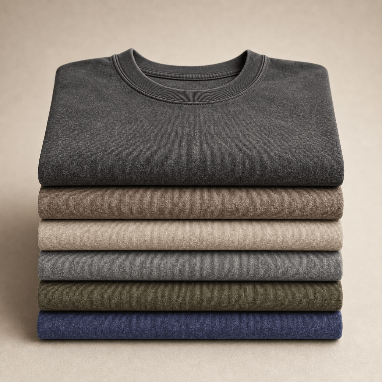
Porter vos valeurs : le guide des imprimés durables
La durabilité d'un t-shirt imprimé pour homme ne concerne pas seulement le coton biologique. Il s'agit de toute la chaîne de décisions qui façonnent le vêtement. Le tissu compte. L'encre compte. La finition compte. L'emballage compte aussi.
Cette vision plus large est encore plus importante pour les acheteurs canadiens qui essaient d'éviter le compromis habituel entre style et responsabilité.
La demande de t-shirts imprimés pour hommes utilisant des encres compostables à faible impact a augmenté de 37 % au Canada au cours de la dernière année, parallèlement à une augmentation de 42 % des recherches liées à la décoloration des imprimés et aux matériaux non toxiques, selon ce résumé des tendances cité. Le message est clair. Les gens veulent des t-shirts plus sûrs, plus durables et mieux adaptés à leurs valeurs.
Ce que comprend un t-shirt imprimé plus responsable
Un t-shirt durable devrait répondre à plus d'une question.
Il devrait vous dire de quoi est fait le t-shirt, comment l'impression a été appliquée et quel type de déchets l'achat génère après avoir quitté l'entrepôt. Si une marque ne parle que d'une partie, le tableau est incomplet.
Recherchez des signes de considération tels que :
- Choix de tissus biologiques qui réduisent la dépendance aux systèmes de coton conventionnels
- Encres à faible impact qui évitent la sensation lourde et synthétique que de nombreux acheteurs n'aiment pas
- Méthodes de finition responsables qui créent de la douceur et du caractère sans agressivité inutile
- Emballages compostables ou recyclés afin que l'achat ne se termine pas par des déchets évitables
Pourquoi la chimie de l'impression affecte l'usure autant que la conscience
Les gens traitent souvent la durabilité et la performance comme des conversations distinctes. En pratique, elles se chevauchent.
Les encres utilisées sur un t-shirt influencent le toucher, la respirabilité et la façon dont le graphique s'intègre naturellement au tissu. Les options à faible impact plaisent souvent non seulement parce qu'elles sonnent mieux sur le papier, mais aussi parce qu'elles peuvent produire une surface moins plastique sur le vêtement lui-même.
Cela ne signifie pas que toutes les allégations écologiques sont significatives. Certains termes sont vagues. « Vert », « naturel » et « responsable » peuvent cacher un manque de détails.
Une question plus utile est la suivante : le t-shirt donne-t-il l'impression que quelqu'un a pensé à toute la vie du vêtement ?
Cela inclut la finition. Une surface douce de style vintage peut être obtenue négligemment ou soigneusement. La différence réside dans le processus, les produits chimiques utilisés et la volonté de la marque d'expliquer la méthode. Cette discussion sur le délavage durable et comment une finition vintage peut être réinventée de manière responsable est un bon exemple de ce à quoi ressemble une véritable transparence des processus.
La durabilité, c'est aussi conserver le t-shirt plus longtemps
Un t-shirt qui se défait rapidement n'est pas un achat responsable, même si l'histoire de la fibre semble bonne. La longévité fait partie de la durabilité car le vêtement porté le plus longtemps a souvent le plus de valeur dans une vraie garde-robe.
C'est pourquoi les meilleurs t-shirts imprimés durables partagent généralement quelques qualités :
| Caractéristique | Pourquoi c'est important |
|---|---|
| Coton épais | Il supporte les cycles répétés de port et de lavage |
| Impression réfléchie | Elle réduit le risque d'une surface lourde et craquelée |
| Finition douce mais stable | Elle permet au t-shirt de bien se sentir dès le début sans se déformer rapidement |
| Emballage à faible déchet | Il étend les valeurs de la marque au-delà du vêtement |
La durabilité devient crédible lorsque le t-shirt semble mieux fabriqué, et pas seulement mieux commercialisé.
Pour un acheteur canadien exigeant, cette combinaison est la norme à rechercher. Pas un slogan. Une chaîne de décisions que l'on peut voir et sentir.
Votre liste de contrôle IdyllVie pour choisir le bon t-shirt
Lorsque vous évaluez un t-shirt imprimé pour homme, il est utile d'arrêter de penser comme un chasseur de bonnes affaires et de commencer à penser comme un éditeur de vêtements. Vous ne vous demandez pas seulement si le graphique est beau. Vous vous demandez si le t-shirt mérite une place dans votre garde-robe pendant des années, et non des mois.
La liste de contrôle utile la plus courte
Parcourez ces questions avant d'acheter :
- Le tissu semble-t-il consistant ? Un meilleur t-shirt a généralement du corps, pas de la fragilité. Il doit être stable au toucher et doux sans devenir mou.
- L'impression convient-elle au tissu ? Un graphique raffiné devrait être à l'aise sur le tissu. Si l'œuvre d'art semble trop brillante, trop dense ou trop criarde pour le t-shirt, le décalage se verra à l'usage.
- La silhouette correspond-elle à votre style ? Choisissez d'abord la forme, puis la taille. Une impression sur la poitrine sur une coupe classique est différente de la même impression sur un corps slim ou décontracté.
- Le placement semble-t-il équilibré ? Le motif doit s'intégrer naturellement sur le torse. S'il semble étrangement haut, bas, minuscule ou surdimensionné, faites confiance à cet instinct.
- Pouvez-vous imaginer en prendre soin correctement ? Si le t-shirt semble déjà fragile ou trop délicat, il risque de ne pas devenir un favori à long terme.
Les signaux de qualité que les gens négligent souvent
Les meilleurs indices sont généralement physiques.
Vérifiez le col. Sentez le poids du corps. Remarquez si le graphique modifie trop le drapé. Regardez les coutures. Demandez-vous si le t-shirt semble bien composé avant même de décider si vous aimez l'œuvre d'art.
Voici une lentille d'achat simple :
| Demandez-vous | Bon signe |
|---|---|
| Sera-t-il toujours beau après une utilisation régulière ? | Le tissu et l'impression sont stables |
| Puis-je le porter de plusieurs façons ? | Le design est suffisamment sobre pour être superposé |
| Correspond-il à mes valeurs ? | Les matériaux, la finition et l'emballage font preuve de transparence |
L'objectif ultime
Un bon t-shirt imprimé devrait faire trois choses à la fois. Il devrait être agréable à porter, bien paraître dans une garde-robe et bien vieillir pour justifier d'être conservé.
C'est la différence entre acheter un t-shirt et en choisir un judicieusement. Lorsque le tissu, l'imprimé, la coupe et la durabilité s'accordent, le vêtement cesse d'être un basique jetable. Il devient l'une des pièces les plus faciles que vous possédez.
Si vous êtes prêt à choisir un t-shirt imprimé avec plus d'intention, explorez IdyllVie. La marque allie coton biologique épais, finitions délavées réfléchies, emballages consciencieux et design discret pour les acheteurs qui veulent des essentiels quotidiens aussi agréables à porter qu'à regarder.


0 commentaire